Social determinants of health (SDoH) shape outcomes just as much as clinical care, but most public-health data is hard to grok as a table or a static chart. The granular patterns that drive disparities get lost. I recently built a Plotly/Dash visualizer for the Principled Deprivation Index, hosted at pdi-visualizer.onrender.com, that lets anyone explore a suite of deprivation indexes alongside CDC-reported condition rates, all mapped to U.S. counties.
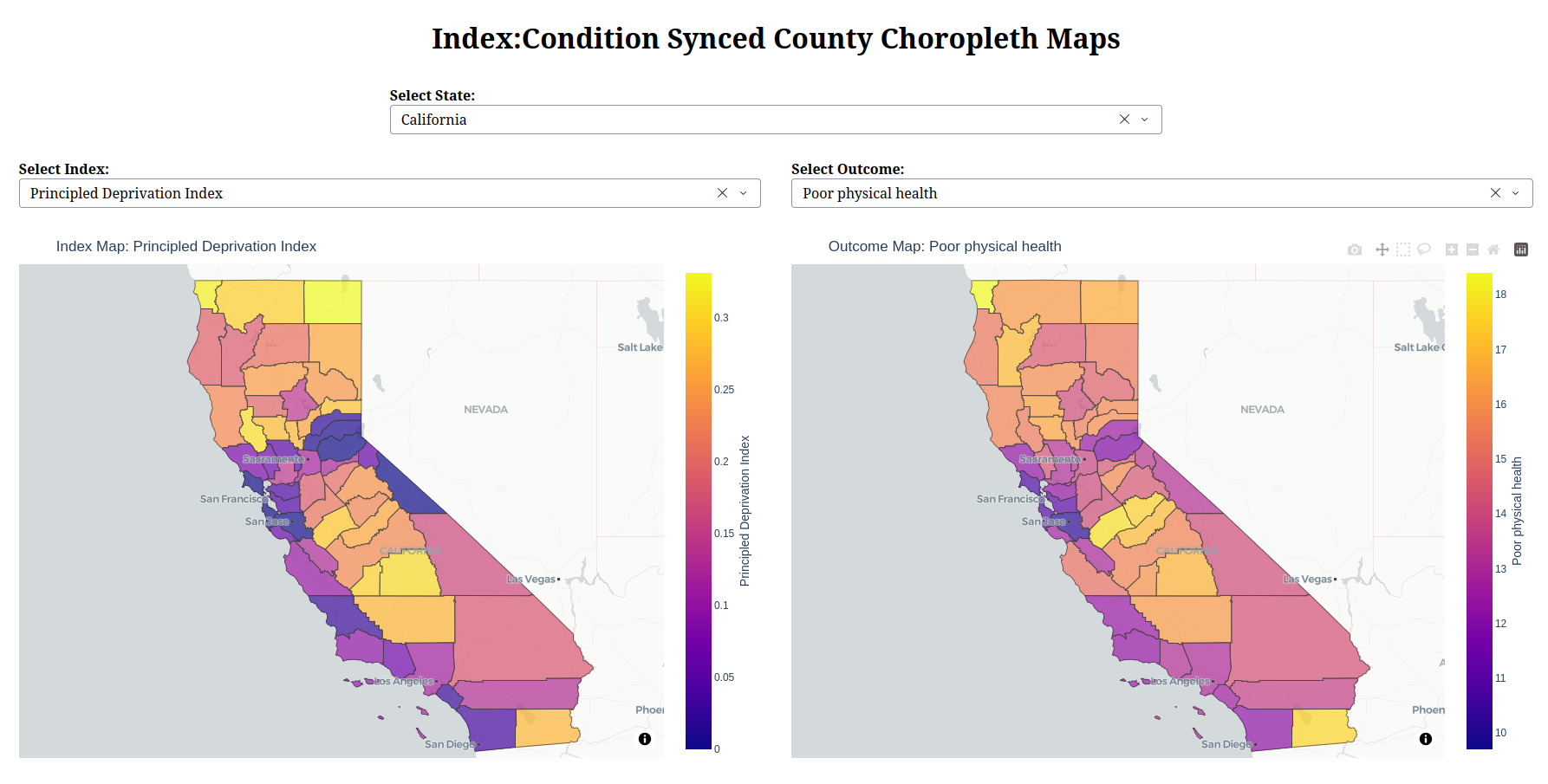
Features Link to heading
- Two synchronized choropleth maps: Allows easier exploration
- State Selector: Centers viewport and normalizes colormap for greater visual variance
- Index and Outcome Selectors: Select different combinations to compare and contrast.
- Hover-over details: Yields exact values for easier reading.
- Responsive layout
What Makes the “Principled Deprivation Index” Worth Mentioning? Link to heading
The PDI is a composite metric that blends income, education, housing stability, adverse weather, public safety, and food access into a single score. While the code doesn’t compute it (the CSV already contains the values), the visualizer treats it exactly like any other index:
- Higher PDI → Higher deprivation (the scale is inverted compared to typical wealth indices).
- Because it’s normalized across all counties, you can spot outliers instantly: a county with a PDI of 0.85 versus the national mean of ~0.45 signals severe deprivation.
Seeing PDI side-by-side with, say, stroke_crudeprev lets you ask the right questions: “Is stroke prevalence driven by deprivation, or are there other factors at play?”
Bottom Line Link to heading
The visualizer is a bare-bones, data-driven dashboard that does one thing well: it juxtaposes county-level deprivation indexes with CDC health outcomes and keeps the two viewports in sync. It’s not a polished commercial product, but it’s a solid foundation for anyone who wants to explore SDoH patterns without wading through spreadsheets.
If you’re a public-health analyst, policy maker, or just a data nerd, fire it up, pick a state, and let the maps tell you where the biggest gaps lie. Then decide whether you need to dig deeper: maybe with a predictive model, maybe with community outreach. Either way, you’ve got a visual starting point.
Happy mapping!